# Replicate Labs / Join a call
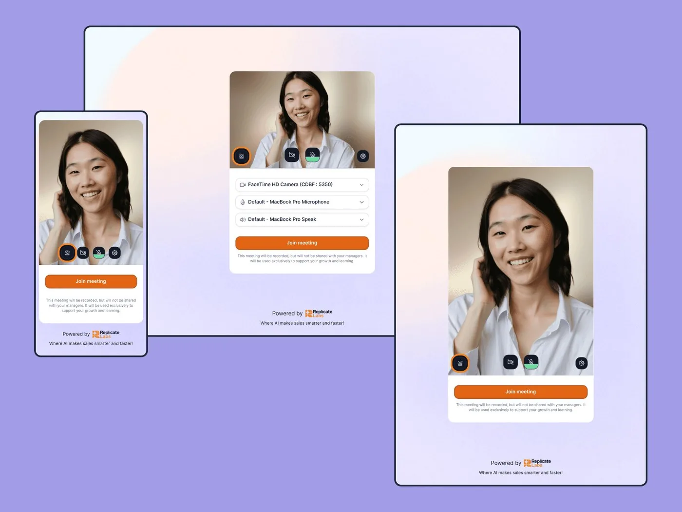
Case studyResponsive
One flow, 3 screen sizes
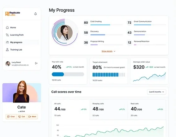
Join-meeting screens for a video call with the AI coach, designed for desktop, tablet and mobile.
Read the case studyThe work
The layout rules that keep a product clear at every size, from wide monitors to small phones.
The problem
If 2 or more of these ring true, you need layout rules, not just more screens.
Tick the ones that sound like you
Selected work
Client case studiesScreens on Dribbble and BehanceClient work
# Replicate Labs / Join a call
Case studyResponsive
Join-meeting screens for a video call with the AI coach, designed for desktop, tablet and mobile.
Read the case study# Teacherspace / Web and mobile
ClientWeb and mobile
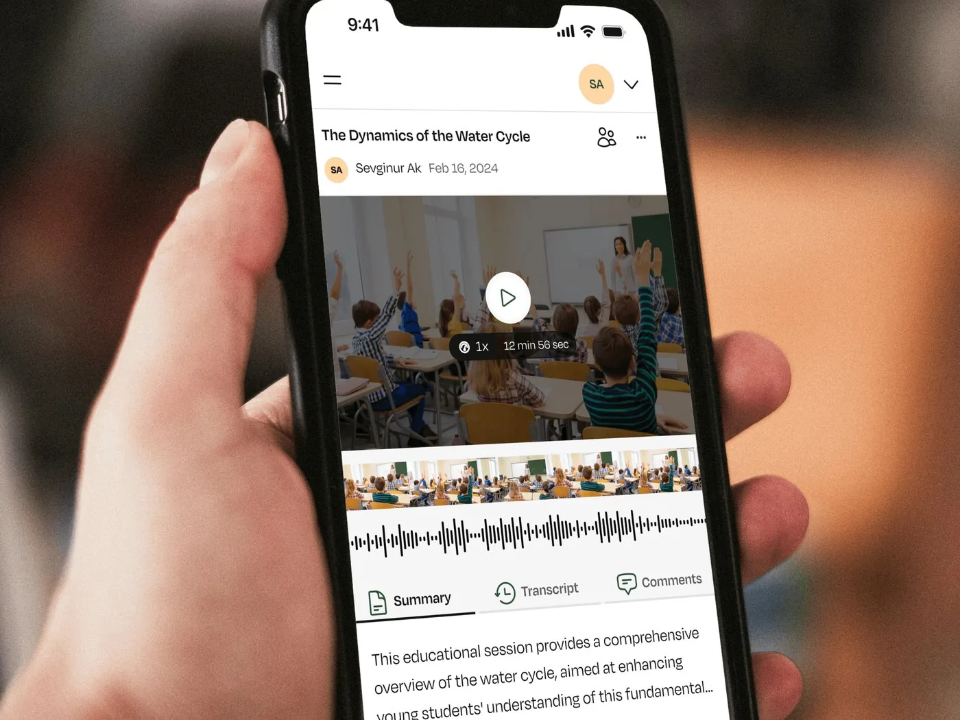
We designed web and mobile experiences for Teacherspace’s secure teaching video, feedback and educator collaboration tools.
See all clients# Influencer Marketing AI / Locked insights
ScreensResponsive
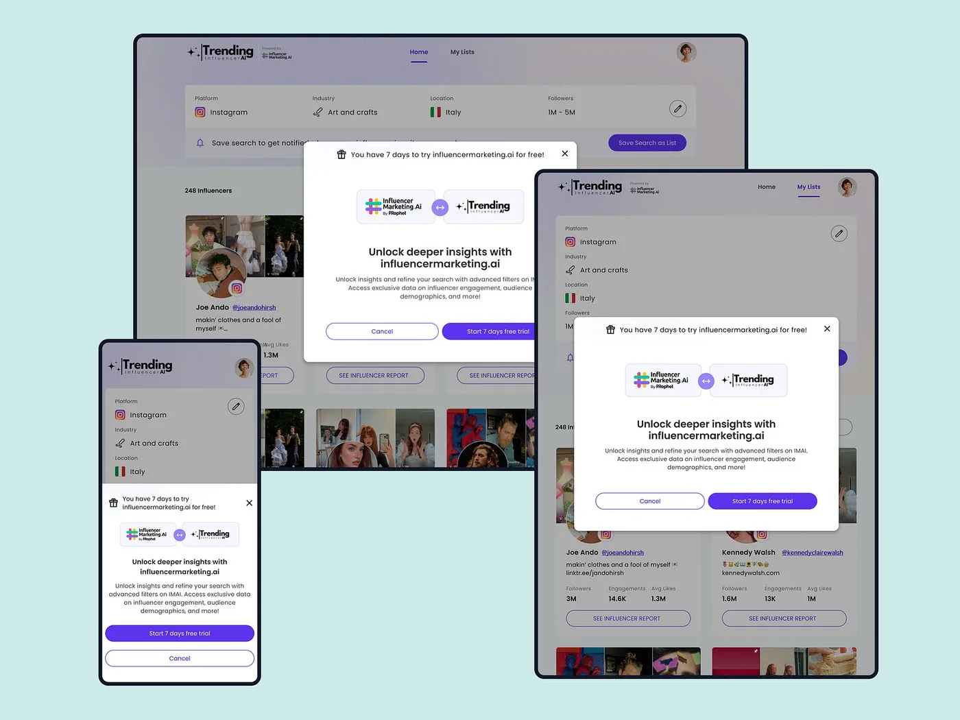
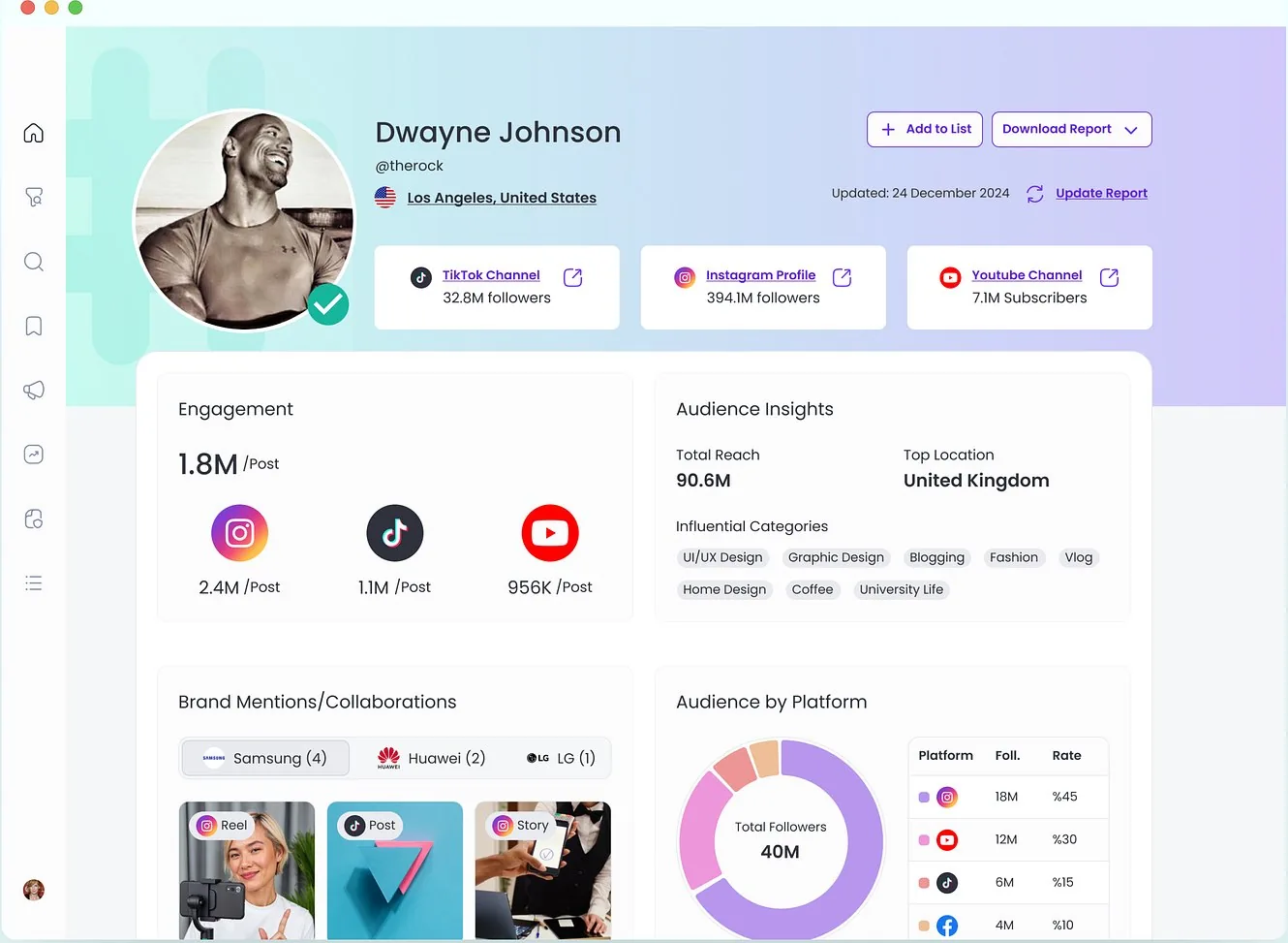
An upgrade modal that keeps its hierarchy on desktop, tablet and mobile.
View on Dribbble# Replicate Labs / Coach profile
ScreensResponsive
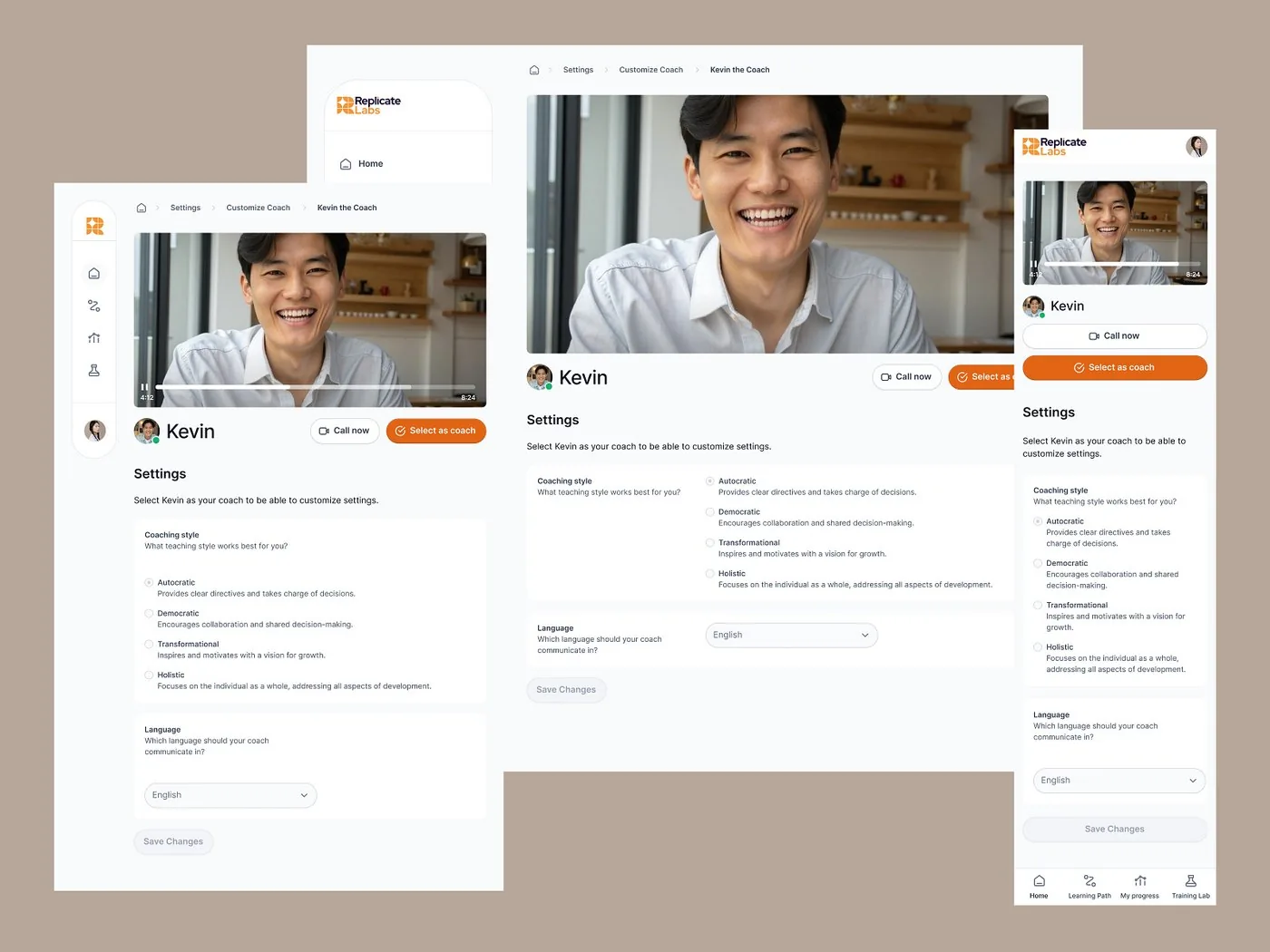
Coach customisation and video profile screens that rearrange for each screen size.
View on DribbbleProof
“When we bring her a new feature idea, she quickly turns it into thoughtful design options with relevant user states, journeys, and clear assumptions.”
Ways to start
Set layout rules for a new product, or fix the screens that break today.
# New product
Layouts and rules for desktop, tablet and phone, defined before the build.
# Existing product
Find the screens that break on smaller devices, then redesign them.
The ones your users actually use. We usually define layouts for desktop, tablet and phone, plus the rules in between.
It depends on the scope. Once we’ve seen the full picture, we’ll share a rough timeline.
We design one product with clear rules for each breakpoint, and separate layouts only where the task really changes.
Yes. We review how it behaves on real devices and fix the screens that break first.
No. We’re a design studio. You get layouts, rules and handoff files your developers build from.
2 client slots open
A rough idea is a fine place to start. We’ll get back to you within 24 hours.